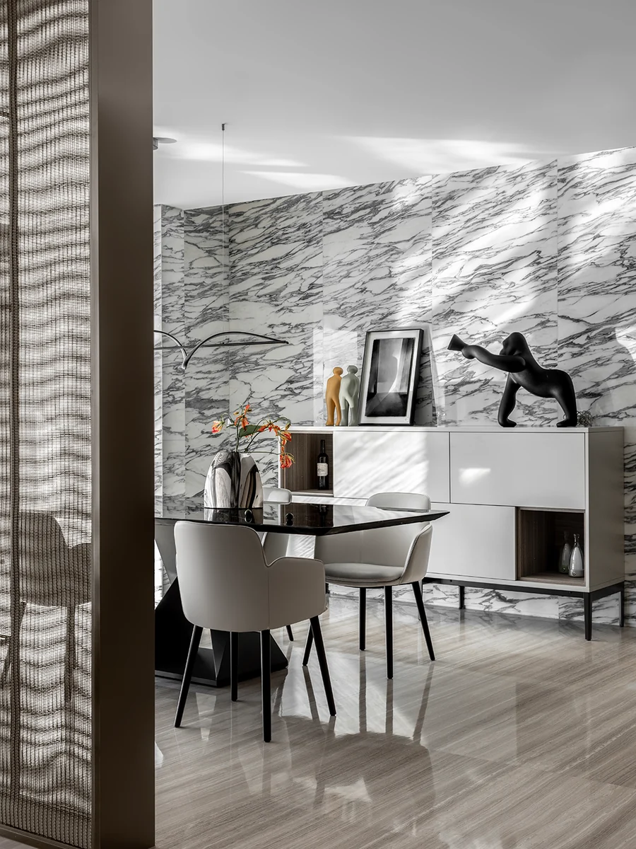
Material pairings
How to Pair Natural Stone With Wood, Metal, Plaster, and Color
Build a room that feels warm, quiet, graphic, or expressive by pairing stone with materials that support its natural character.
What should I place beside natural stone so the whole room feels balanced?
Stone rarely stands alone in a room. Its character changes beside wood, metal, plaster, and color, so the best pairing begins with the atmosphere you want to come home to.
Build a feeling, not a formula
Choose the mood before the materials
Start with three words for the finished space: perhaps warm, quiet, and welcoming, or crisp, graphic, and confident. Those words give you a clearer guide than trying to match every surface perfectly. Natural variation is part of stone’s appeal; the surrounding materials should support it, not compete with every line and color.
The four moods below are starting points. Borrow the combination that feels closest to you, then adjust its warmth, contrast, and color until it belongs in your room.
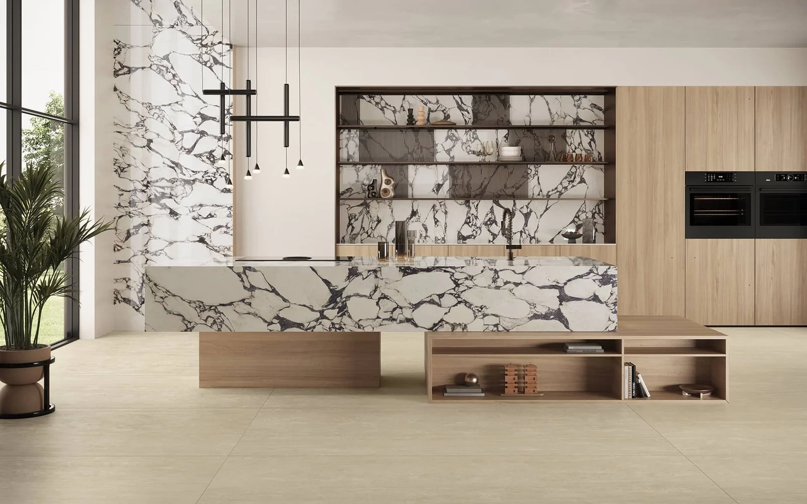
Stone with light or honeyed wood
Timber softens strong veining and brings warmth to pale stone. Choose wood with a calm grain if the stone is expressive, or a more visible grain beside a quieter surface. Cream textiles and warm white walls keep the combination relaxed rather than rustic.
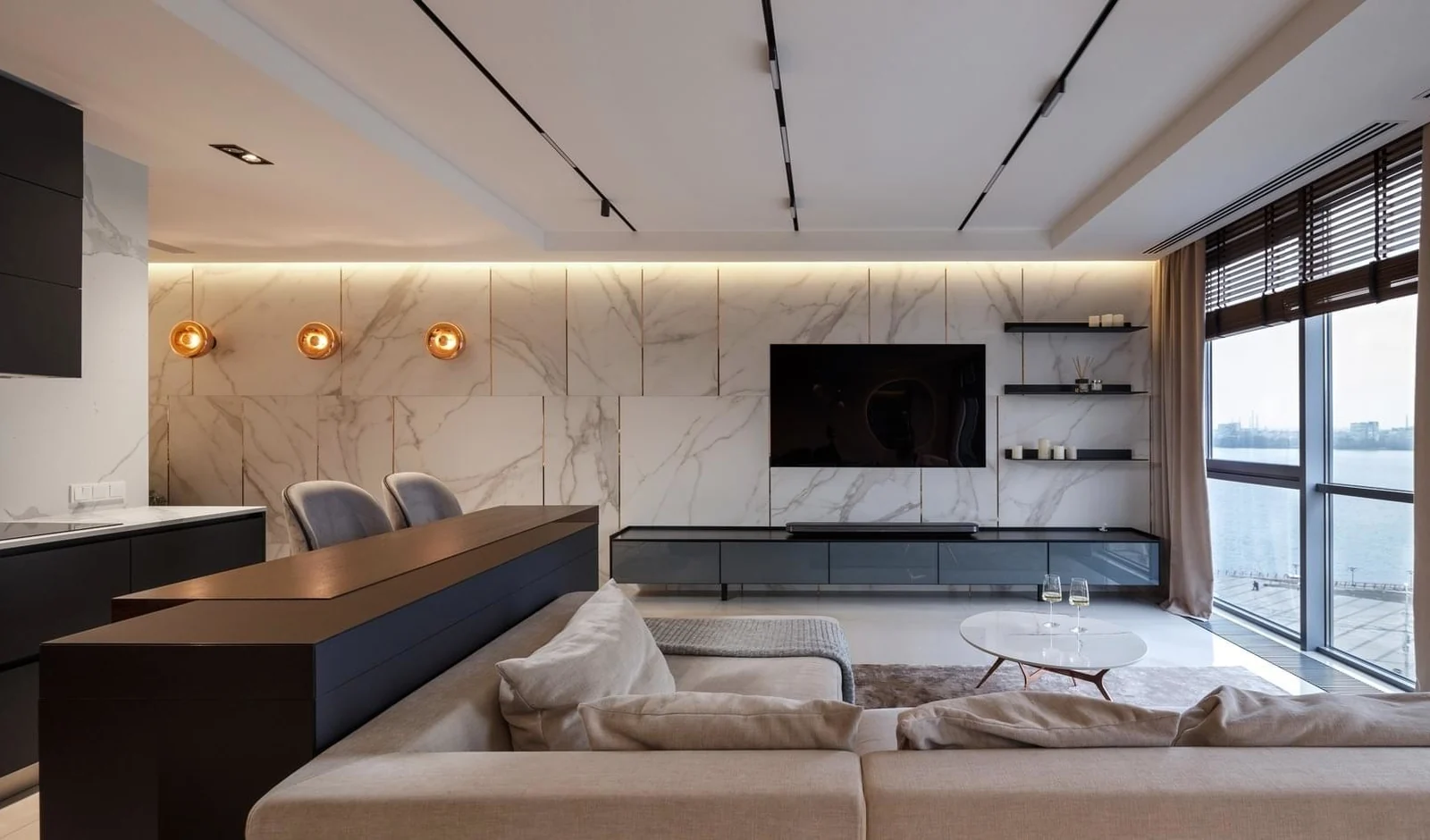
Stone with dark metal
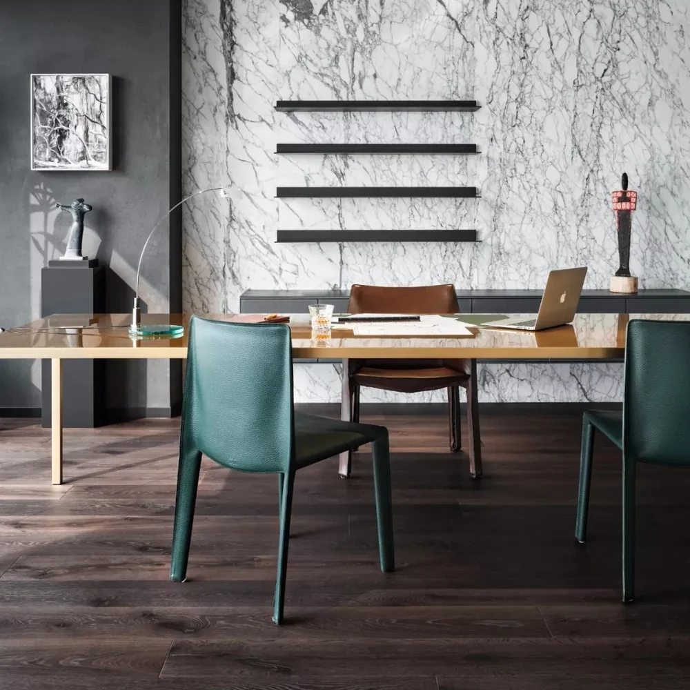
Black, bronze, or deep gray metal gives a stone surface a clear outline. Use it in shelf frames, lighting, or handles rather than everywhere. The repeated dark accents help the eye move around the room and can make pale stone feel sharper and more modern.
Stone with plaster and gentle neutrals
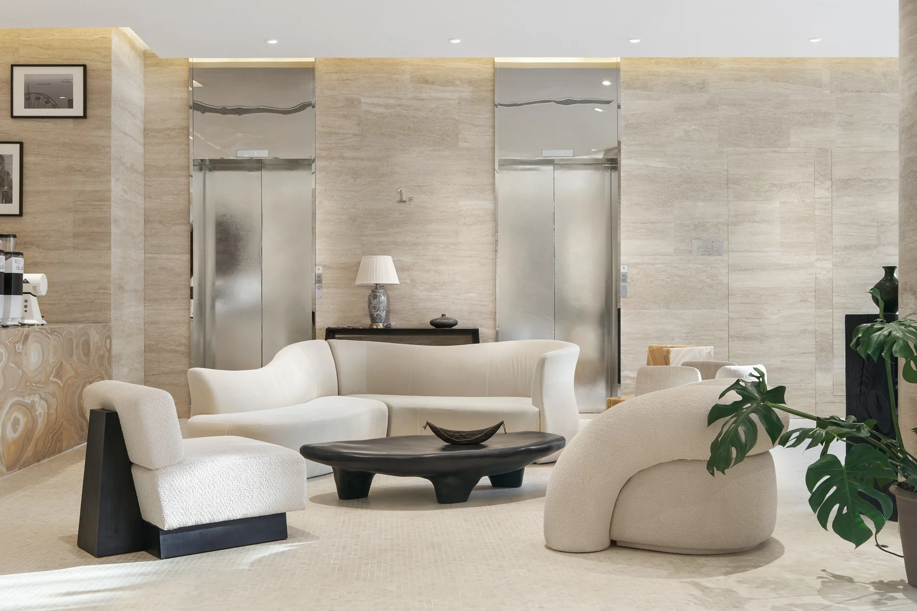
Lime, chalk, sand and mushroom tones create an easy transition from stone to wall. A smooth plaster finish keeps the room calm; a softly textured one adds depth without another strong pattern. This mood works especially well when daylight is part of the design.
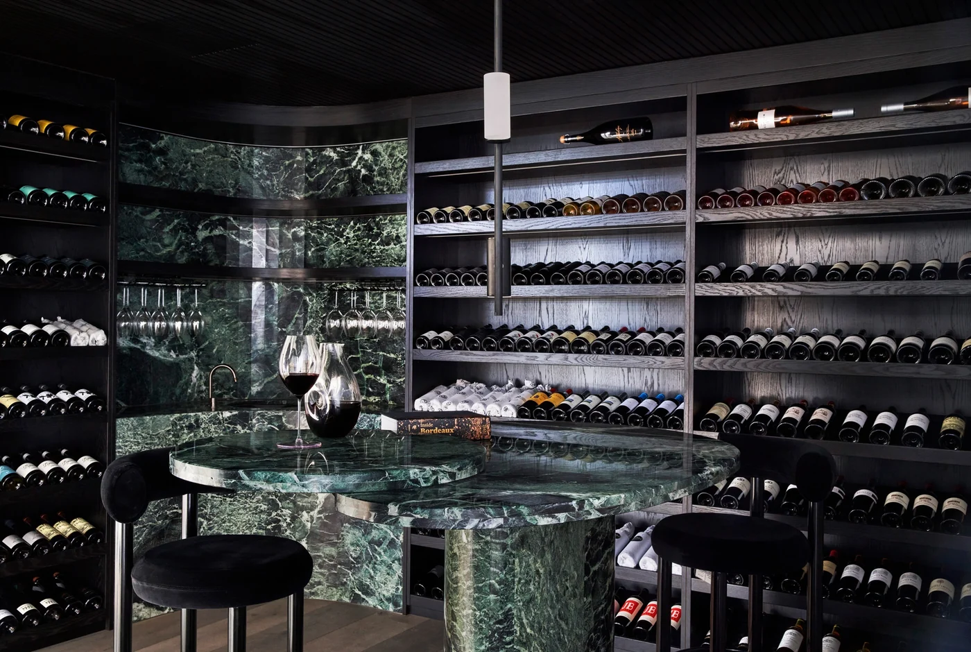
Stone with confident color
Pick one color already present in the stone and echo it nearby in paint, upholstery, or a single piece of furniture. Deep green, clay, ink blue, or muted red can make the natural pattern feel intentional. Keep the remaining surfaces restrained so the color has space to work.